 e many great visuals used these days, though the Geico gecko is cute.
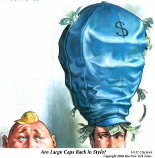
Here's an example of what a little imagination can do from The New York Times, which is doing its stuffy best to become less gray, more graphic.
The illustration is by Matt Collins. It accompanies an article on why large-capitalization stocks could be a good buy. (One reason: small investors have been dumping large-cap funds for the first time since 1994.)


No comments:
Post a Comment